Back
 Email Me
2024 • Logistics • Case study
Truck App
Truck App is a driver companion platform designed to help truck drivers stay on top of their daily deliveries
ABOUT THE PROJECT
What Is Truck App?
Truck App is a driver companion platform built to give drivers better visibility and control throughout their day. It brings together their trips and deliveries, performance insights, and truck status, helping them stay informed and focused while on the road.
To make navigation familiar and frictionless, the app integrates with Google Maps, a tool most drivers already use and understand
THE PROBLEM
Reason For The Redesign
“The app feels outdated, we want a modern and engaging experience. Our drivers need quick access to the information they rely on every day, so we also want to reduce the number of clicks needed to get to key information”

Oluwafemi Emmanuel
Product Owner @Truck App
The Product Owner's feedback captured the broader challenges with the old design. I used these observations to identify the core problems the redesign needed to address and define a clear focus for the project.
Core Problems
Too Much Friction
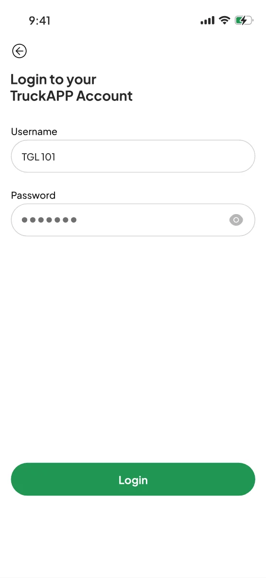
Drivers had to navigate through multiple screens to access important day-to-day information. This created unnecessary friction, especially for information they need before or during a trip
Confusing Workflows
Some parts of the app were difficult for drivers to understand or navigate. As a result, certain features were rarely used or eventually abandoned
Outdated User Interface
The existing interface felt dated compared to other competitor apps, making the overall experience less engaging and harder to navigate.
Navigation Wasn't Seamlessly Connected to the Workflow
Drivers had to copy delivery location from the app, and paste in google maps, creating friction in an otherwise straightforward workflow
The Design Wasn't Built to Scale
As the product evolved, the existing design made it difficult to introduce new features and maintain consistency across screens. There was no structured component library or design system in Figma, so similar UI elements often had to be recreated from scratch
GOALS
What Should The Redesign Do Better?
Create a simpler, more efficient experience that helps drivers get their jobs done with less friction
The redesign focused on making key information easier to access, simplifying everyday workflows, and connecting navigation more seamlessly to drivers’ trips. At the same time, to establish a scalable design system to improve consistency and make it easier for the team to introduce new features as the product grows.
DESIGN PROCESS
How it Started
I jumped on a call with Oluwafemi Emmanuel, the Product Owner at Truck App. Femi walked me through the product, the challenges drivers were experiencing with the existing app, and what the team hoped to achieve with the redesign
I started by reviewing the product's vision and goals with the Product Owner. He walked me through the PRD and other project documentation, then took me through the existing Figma screens, highlighting the issues he had identified with the current experience. This gave me the initial context I needed to understand the product, the problems in the old design, and where I needed to dig deeper.
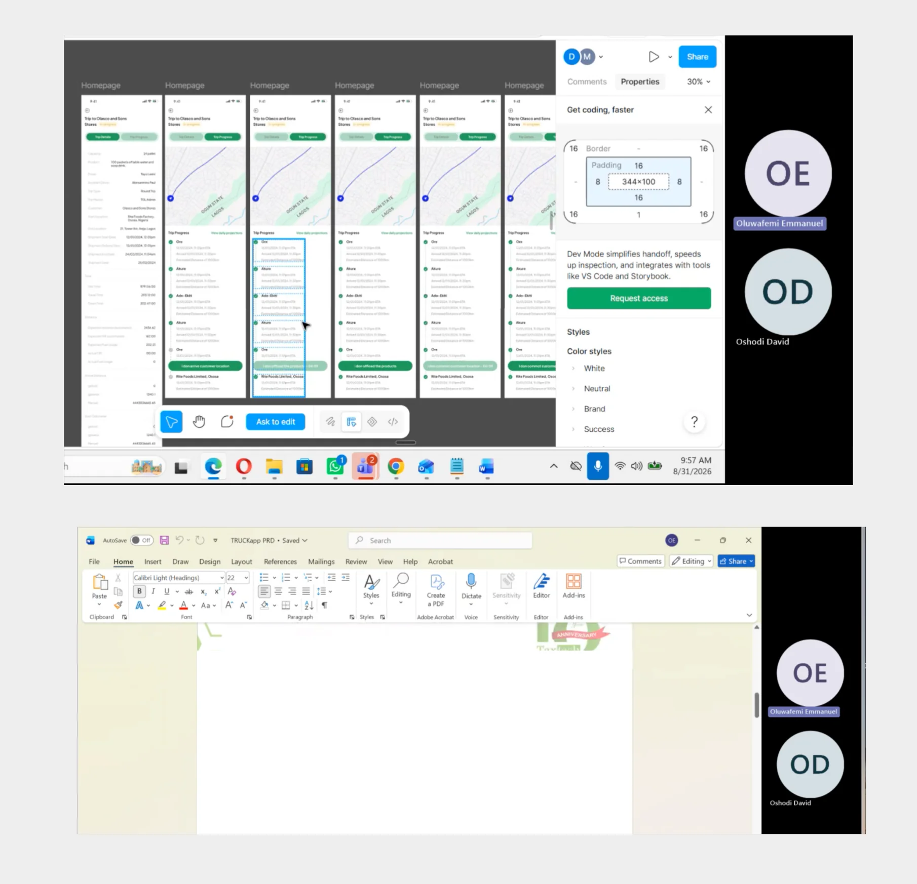
User Flows
I mapped the existing flows to identify unnecessary steps and redesigned key journeys to help drivers complete tasks faster with less friction. The existing experience had several friction points that made important tasks feel more difficult and stressful than they needed to be.
Navigate to Google maps
- View delivery details
- Copy delivery location
- Open google map
- Paste delivery location
- View delivery details
- Click button to open in google maps
Trucks Nearby (Search Trucks)
- Trucks Near me
- Search Trucks
- Enter location & distance radius
- Click on "Find Trucks" Button
- See summary of all trucks
- View full trucks info
- Nearby (Search Trucks)
- Enter location & distance radius
- View summary and all trucks info
Trucks Nearby (Rescue Trucks)
- Trucks Near me
- Rescue Trucks
- Enter truck code
- Trucks' distance
- Nearby (Rescue Trucks)
- Enter truck code
- Truck's distance
FINAL PRODUCT
High Fidelity Designs
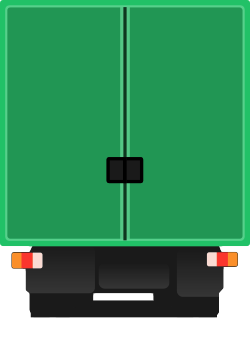
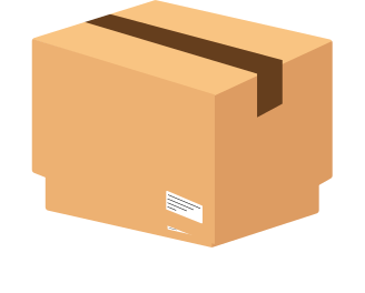
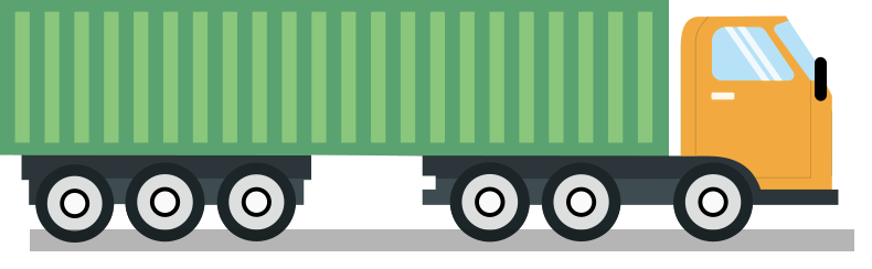
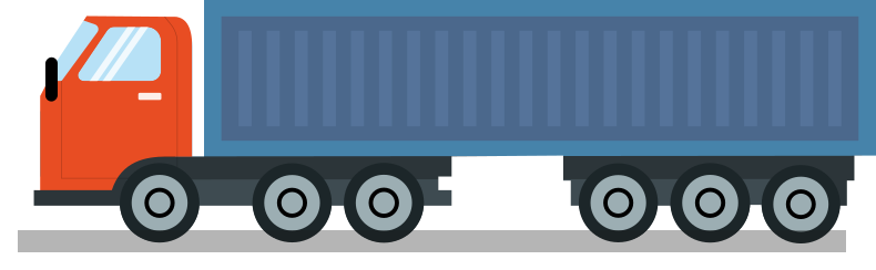
Custom Illustrations
I designed custom illustrations in Figma to bring more visual personality to the app while making key moments in the experience feel clearer and more engaging
Navigation
The bottom navigation provides drivers with quick access to the app's core sections. The previous design relied mainly on icons, making it difficult to immediately understand what each destination represented
What I Improved
- Added clear labels alongside icons so drivers can understand each destination without having to guess what an icon means.
- Used familiar iconography to make navigation easier to recognize at a glance.
- Improved the active state treatment to make it clearer which section the driver is currently viewing.
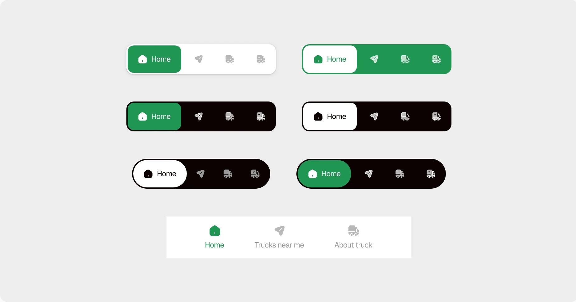
- Explored different navigation layouts and visual treatments before settling on the final direction, considering clarity, hierarchy, and consistency with the redesigned interface.
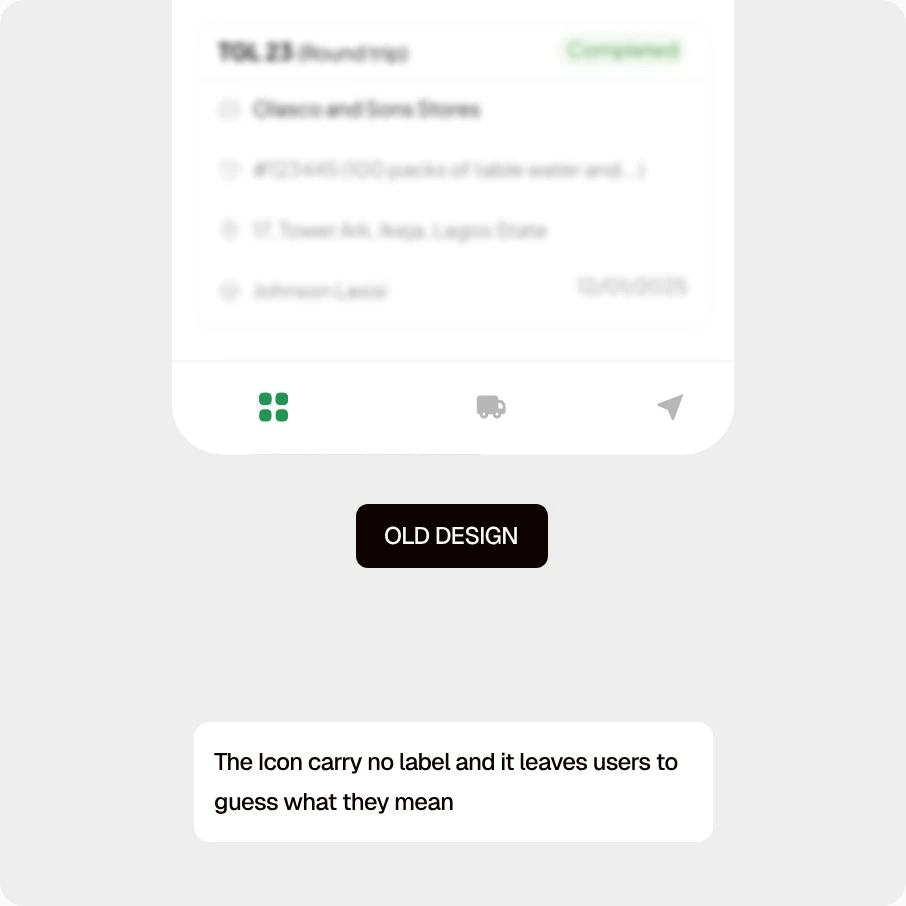 OLD DESIGN
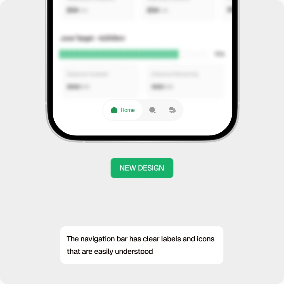 NEW DESIGN
I explored multiple navigation styles and color variations before arriving at the final direction. This helped me evaluate different approaches and choose an option that balanced usability with the look and feel of the new design.
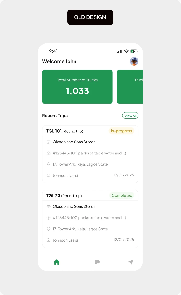
Home Page
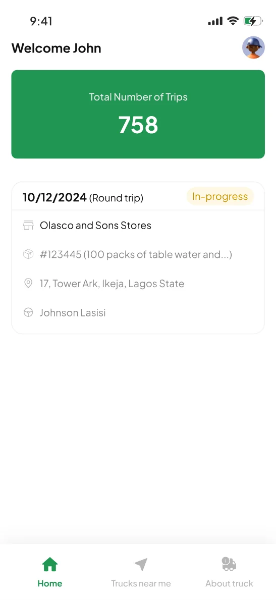
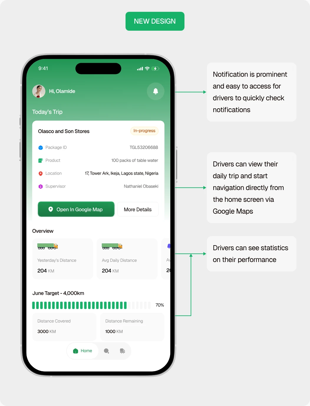
The home page gives drivers a quick overview of their day, bringing their active trip, navigation, notifications, and performance progress into one place. It is designed to help drivers understand what needs their attention and access their most important actions without having to move through multiple screens.
What I Improved
- Made the daily trip the primary focus so drivers can quickly see their active delivery, key trip details, and current status.
- Added direct Google Maps navigation, allowing drivers to start their journey directly from the home screen instead of copying and pasting the delivery location.
- Made notifications more visible by introducing a prominent notification entry point, making important updates easier to access.
- Surfaced performance insights so drivers can quickly see relevant statistics and their progress toward their targets.
 OLD DESIGN
 NEW DESIGN
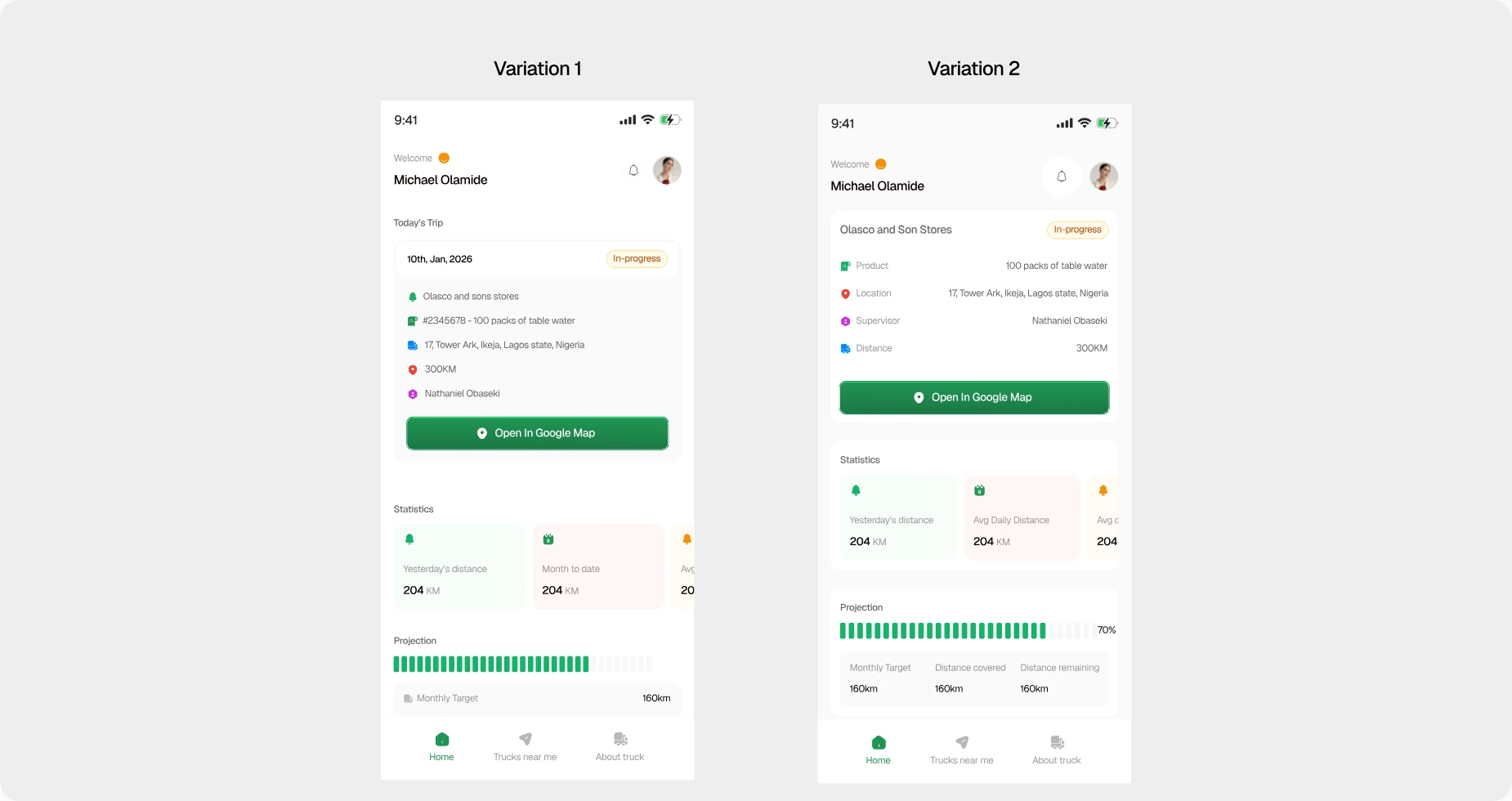
I tried different directions and layouts while carrying the client along until we arrived at the current design
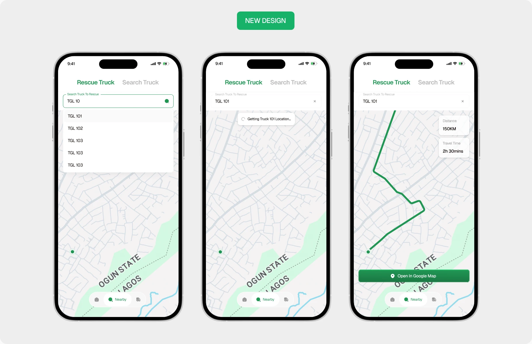
Trucks Nearby - Rescue & Search
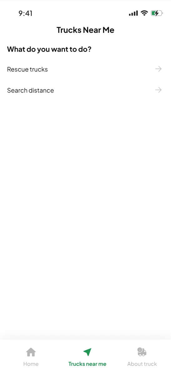
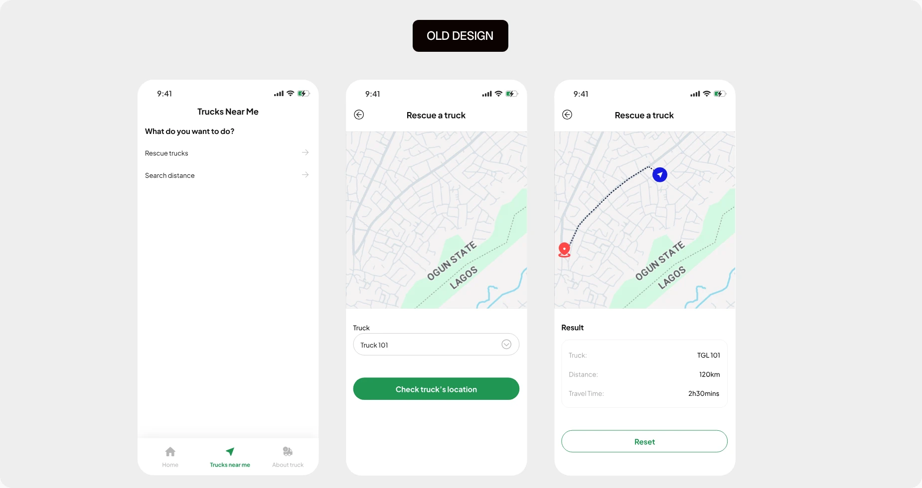
The Trucks Nearby feature helps drivers quickly locate nearby trucks or get to trucks that needs rescue or assistance.
Rescue Truck: Drivers can enter the truck number to locate a truck in need of assistance. The app displays its location and key details, with a direct link to Google Maps for navigation.
Search for a Truck: Drivers can search for trucks within a specific radius by entering a location and distance. Available trucks are displayed directly on the map, along with relevant information.
What I improved
- Combined search and rescue into one experience, keeping the map and key actions on a single screen instead of making drivers navigate between pages.
- Added direct Google Maps navigation so drivers can get directions to a truck's location immediately.
- Simplified the rescue flow by allowing drivers to locate a truck and access its details with fewer steps.
- Improved the visual hierarchy and interface to make the experience cleaner, more modern, and easier to scan.
 OLD DESIGN
 NEW DESIGN
Notification Page
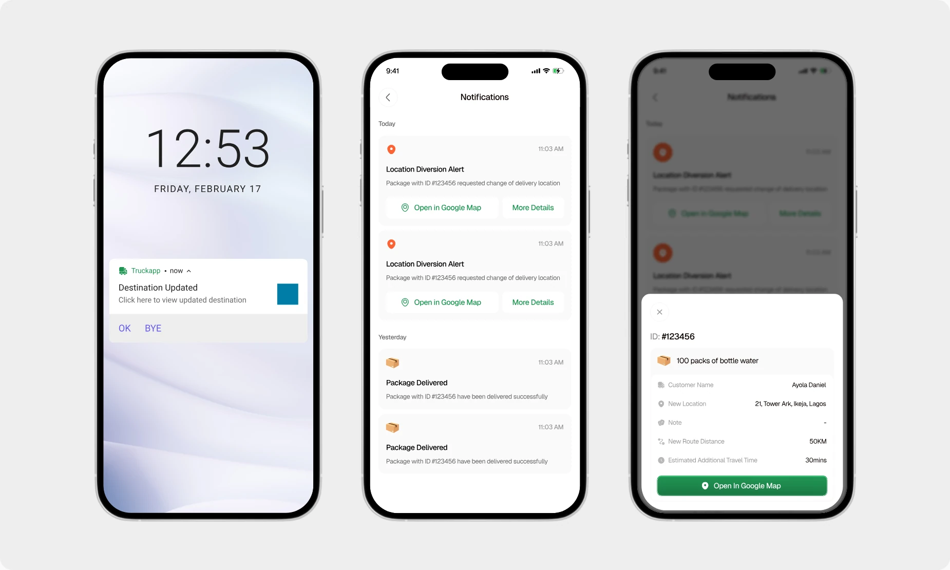
The old design didn't account for a notification page, which I found surprising. I realized how important this page is for drivers because they encounter situations where clients decide to change the delivery location while on the road.
What I improved
- Added a dedicated notification center where drivers can view new and previously missed notifications.
- Introduced push notifications to surface important updates directly on the driver's phone.
- Added delivery milestone notifications so drivers receive updates as they reach key stages of a delivery.
- Recommended SMS alerts for critical changes, such as delivery location diversions, to provide an additional layer of communication.
About Truck
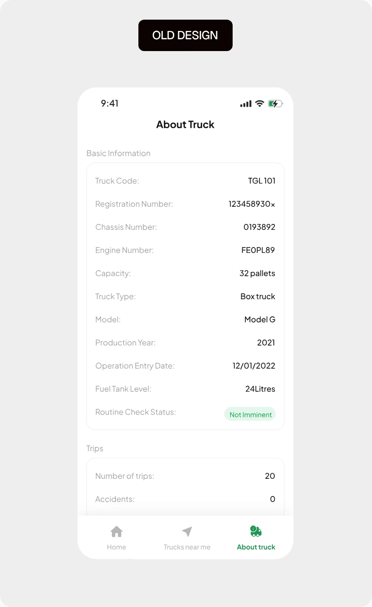
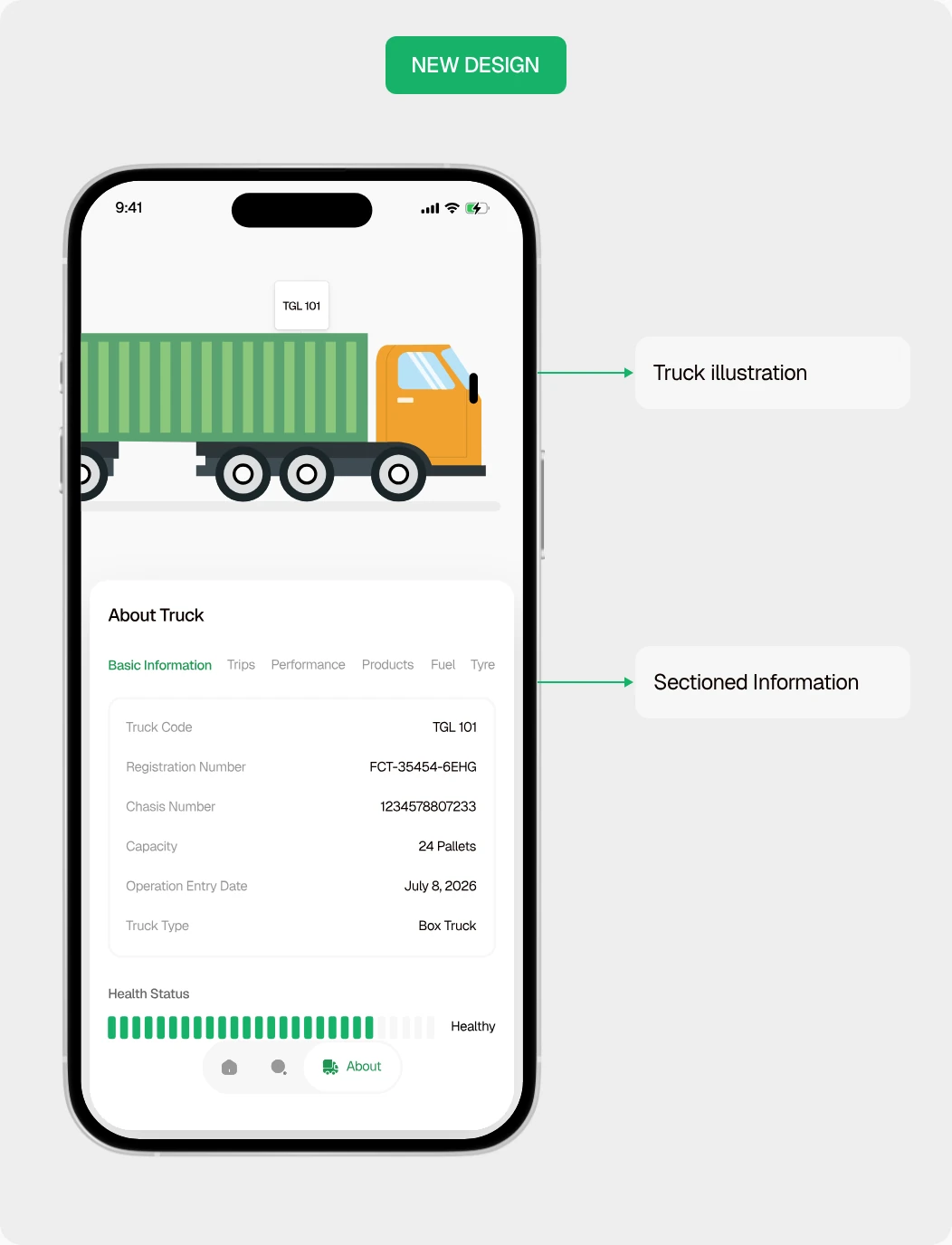
This page gives drivers a complete overview of their assigned truck, including its health status, number of trips, tyre condition, and other important vehicle information. The old design had users scroll through the page to get relevant information, which can be tiring for users.
What I Improved
- Organized truck information into clear sections so drivers can quickly navigate to specific details, instead of scrolling through one long list as in the previous design.
- Improved information hierarchy by grouping related details such as truck health, trips, and tyre condition, making important information easier to find and scan.
- Introduced an interactive truck illustration that allows drivers to explore different parts of the truck while making the experience more visually engaging and intuitive.
- Reduced unnecessary scrolling by structuring the information around how drivers are likely to look for and consume it.
 OLD DESIGN
 NEW DESIGN
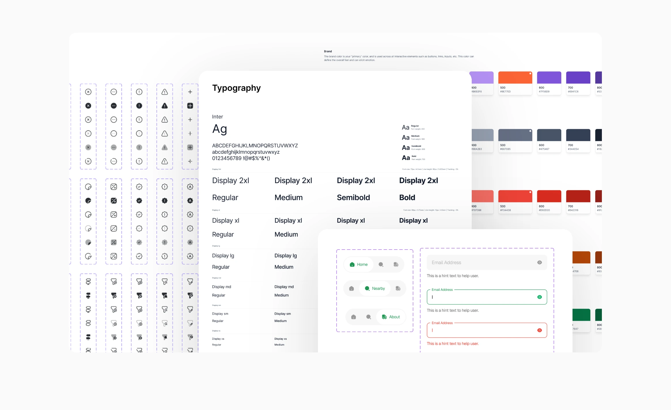
Design System
Not every product requires a design system, but because of the goal and scale of the vision at Truck App, I created a scalable design system and a component library, which I and other future designers and engineers could work with.
CONCLUSIONS
Reflection & Key takeaways
This project reinforced for me that good product design is often about removing friction rather than adding more features. Working through the driver’s day-to-day journey helped me see how small moments of confusion, an unclear icon, an extra step, or information being difficult to find can make a product feel significantly harder to use.
I also learned to look beyond individual screens and think about the experience as a connected system. Simplifying the navigation to Google Maps flow, bringing Trucks Nearby into a single experience, and introducing notifications were not just UI improvements; they were opportunities to make the overall workflow more predictable and useful for drivers.
If I were taking the project further, I would validate the redesigned flows with more drivers and measure task completion, time taken, and error points. This would help identify whether the improvements I designed translate into a genuinely faster and less stressful experience in real world driving conditions.