Back
 Email Me
2025 • Banking • Case study
ALATbyWEMA
ALAT by Wema is Nigeria's first fully digital bank, enabling customers to open accounts and manage their finances entirely online
View Live App
ABOUT THE PROJECT
What Is ALATbyWEMA?
Wema Bank is the pioneer of Africa's first fully digital bank, ALAT, and one of Nigeria's most resilient banks. With decades of experience in the business of banking, the Bank has remained innovative in delivering value to its stakeholders.
The publicly quoted Nigerian company has successfully built a legacy of trust and resilience that has won it the loyalty of its customers. The Bank is constantly introducing products and services tailored to the needs of its customers at every stage of their lives.
ALAT brings essential banking services to customers' fingertips, allowing them to manage their finances and complete transactions such as money transfers, bill payments, airtime purchases, loan requests and many more directly from their mobile devices all without visiting a physical bank branch.
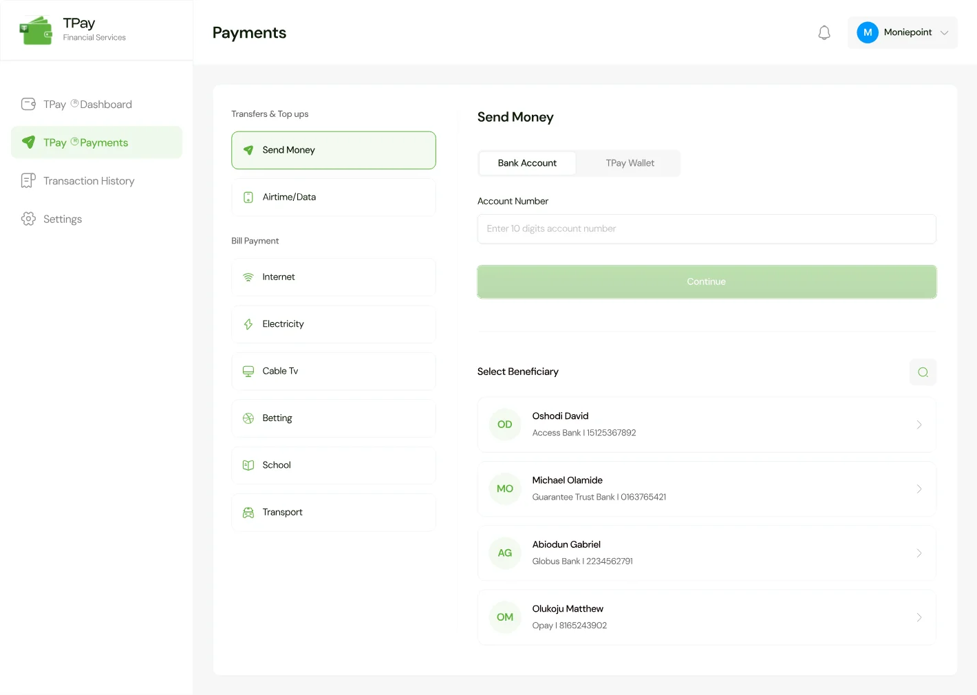
As the app brings multiple financial services into one experience, usability becomes critical. The opportunity was to create a more intuitive, user-centered interface that makes these services easier to discover, understand, and use.
As part of a collaborative design team, each designer was assigned specific areas of the app to work on. I was responsible for the Payments section, covering core activities such as transfers, airtime and data purchases, and bill payments. This case study focuses on my contribution to the Payments experience and the design decisions behind the improvements I made
THE PROBLEM
Reason For The Redesign
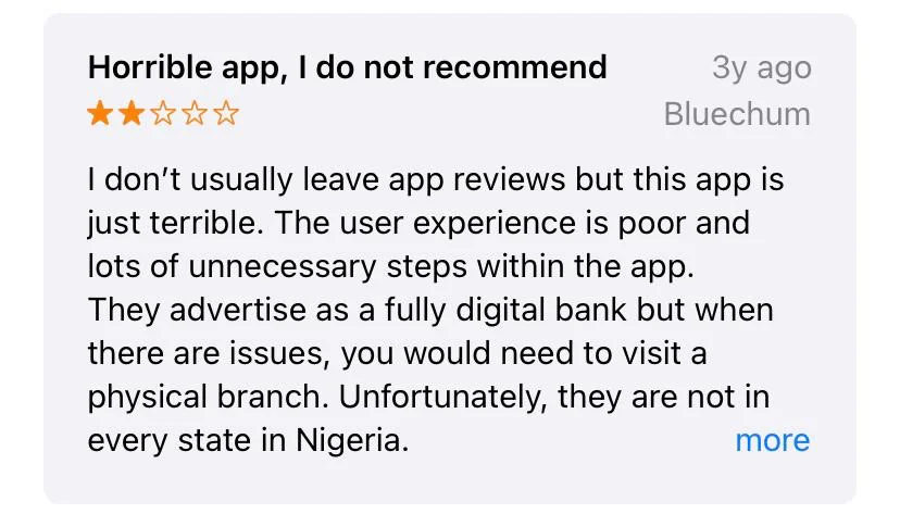
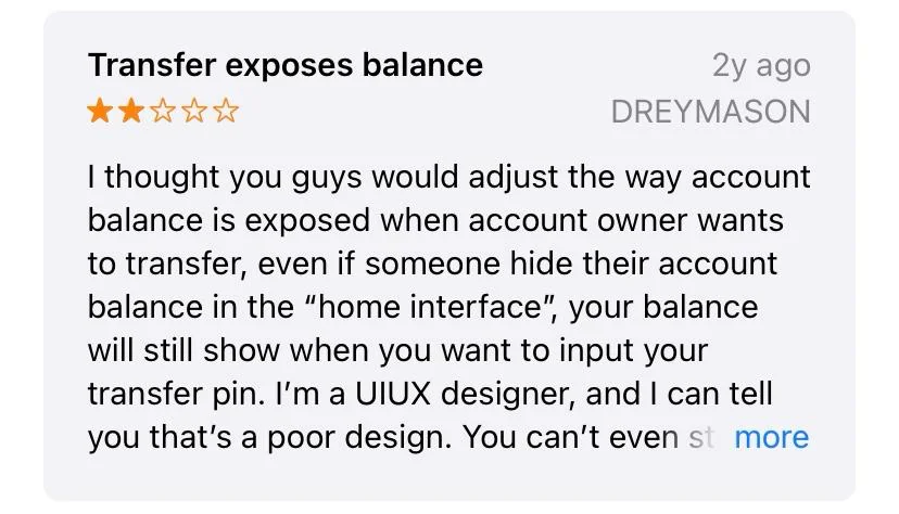
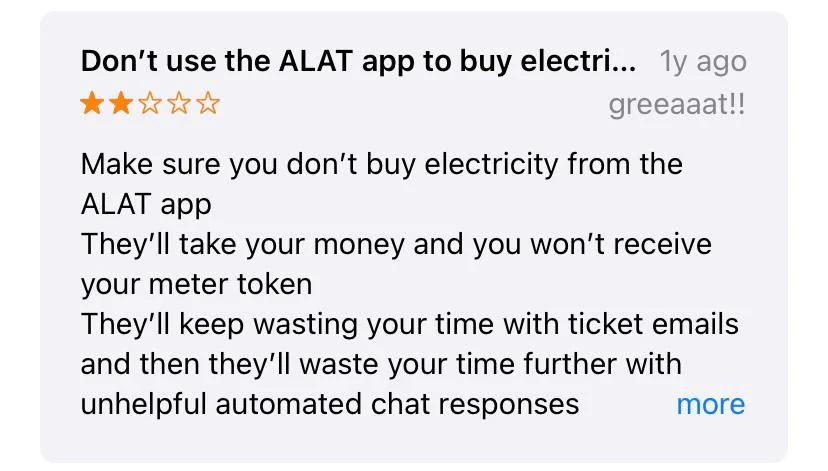
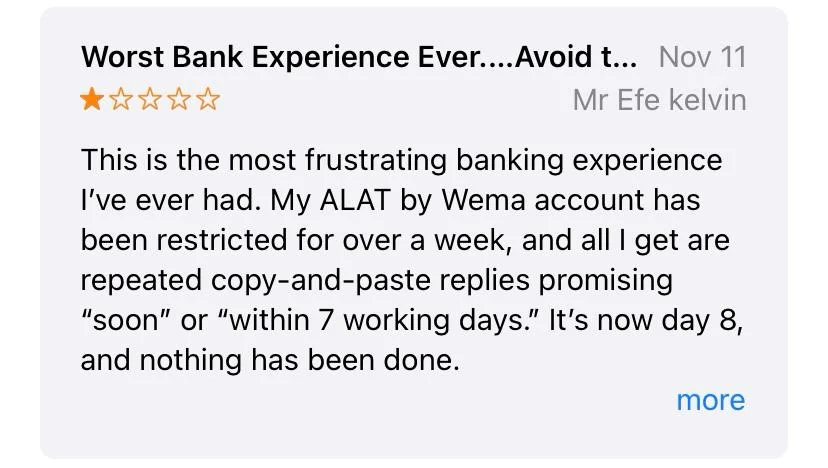
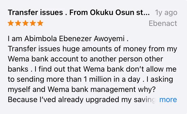
The problems identified were informed by multiple sources, including customer ratings and reviews on app stores, complaints shared across social media, and direct feedback from ALAT customers who use the mobile banking app frequently
Core Problems
Complex Payment Navigation
Customers had to move through multiple screens to find and access payment services. This made common tasks such as transfers, airtime purchases, and bill payments feel more cumbersome than necessary.
Poor Feature Discoverability
Some payment features were not immediately obvious or easy to find within the app. This made it harder for customers to understand what services were available and where to access them
Too Many Steps for Everyday Transactions
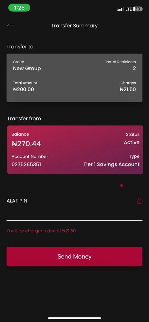
Simple banking activities required users to go through several steps before completing a transaction. This added unnecessary friction to tasks that customers perform frequently
Inconsistent UI patterns across screens
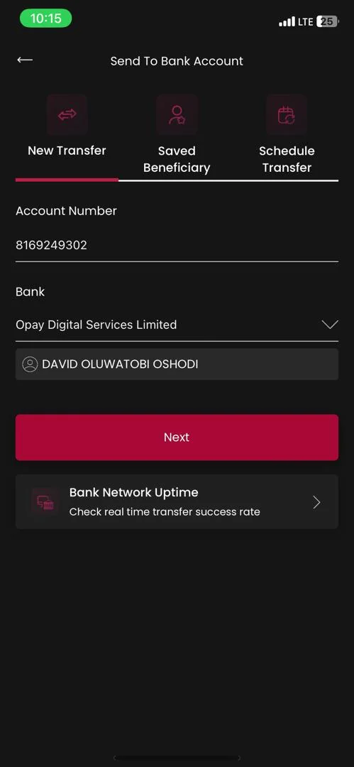
Similar payment experiences did not always follow consistent layouts, interactions, or visual patterns. This made the interface less predictable and increased the effort required to learn and navigate different parts of the app.
Outdated Visual Experience
The old design felt dated and lacked the clarity and polish found in newer digital banking products. This created an opportunity to modernize the interface while making important payment information and actions easier to understand
GOALS
What Should The Redesign Do Better?
The goal was to transform ALAT's Payments experience into an intuitive, efficient, and trustworthy way for customers to manage everyday transactions. The redesign focused on simplifying payment flows, improving feature discoverability, and establishing a consistent, scalable design system
Ultimately, the aim was to help customers complete transactions with greater ease and confidence while strengthening trust in the platform, encouraging continued usage, and supporting customer retention.
DESIGN PROCESS
Turning Insights Into Meaningful Design Decisions
Discovering and Understanding User Pain Points
I synthesized feedback from app store reviews, social media complaints, and direct feedback from frequent ALAT users to identify recurring pain points. These insights were then translated into the core problems (listed above) that shaped the direction of the redesign
Competitive Analysis & Ideation
I conducted a competitive analysis to understand how leading banks approached similar challenges and identify opportunities to improve on existing solutions. I looked beyond traditional banking apps and also explored fintech products that offered innovative approaches to payments, navigation, and user experience.
These insights helped me identify useful patterns, interaction ideas, and opportunities for differentiation, which I then used as inspiration when developing solutions to the core problems identified earlier
Design, Prototype & Test
I validated my ideas early using low-fidelity prototypes before moving into high-fidelity designs. These prototypes were created and tested in Figma with a group of users provided by the bank. I iterated the designs based on each round of feedback, refining the experience until the key flows were clear and intuitive
After validating ideas through low-fidelity prototypes, I progressed to high-fidelity designs. I also worked closely with the bank's management team throughout the process, presenting each major feature and incorporating feedback to ensure everyone remained aligned on the product's visual direction
I contributed to developing the project's design system, creating reusable components and visual patterns that would ensure consistency across the product and support future designs
FINAL PRODUCT
High Fidelity Designs
Payments Hub
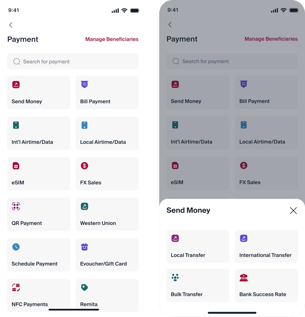
This page brings together all the payment services available on the platform, making them easy to access in one place.
What I Improved
- Centralized payment services: Brought all payment services into one view, with a search function to help users quickly find what they need.
- Quick beneficiary management: Made it easier for users to access and manage their beneficiaries directly from the Payment Hub.
- Clear visual hierarchy: Introduced distinct, colorful icons to make each payment service easier to recognize and understand.
- Scalable design: Created a flexible layout that can accommodate additional payment services as the product grows.
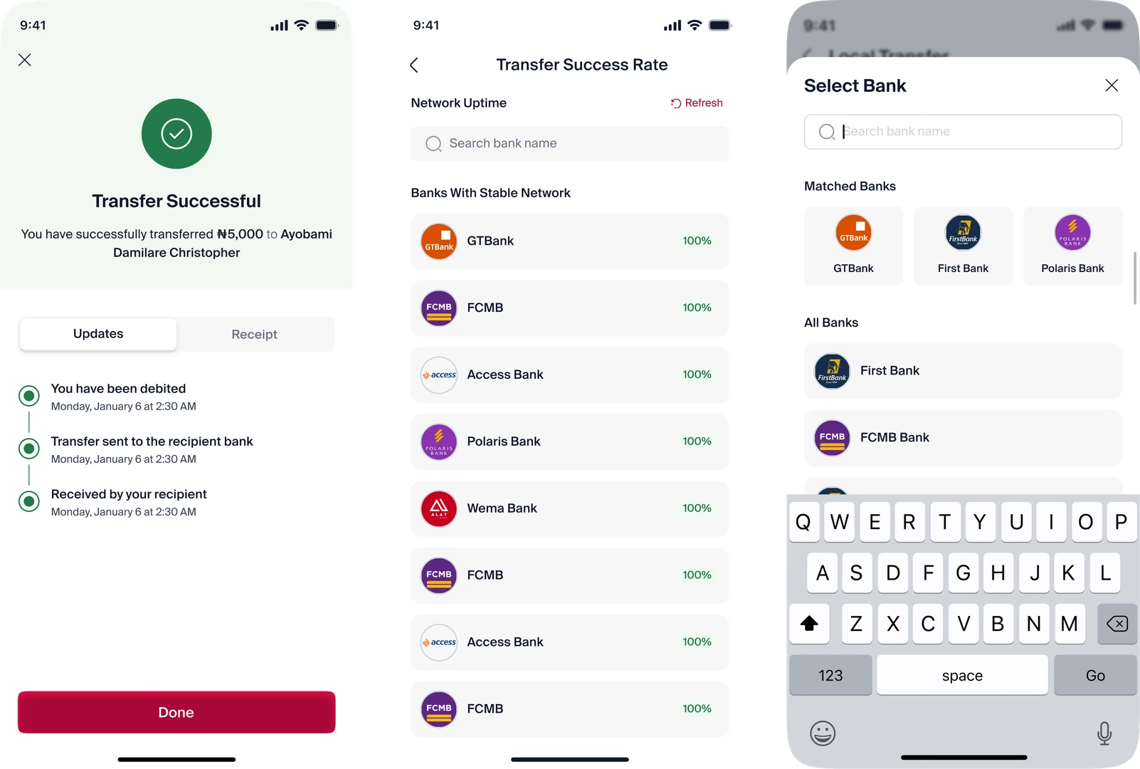
Local Transfer
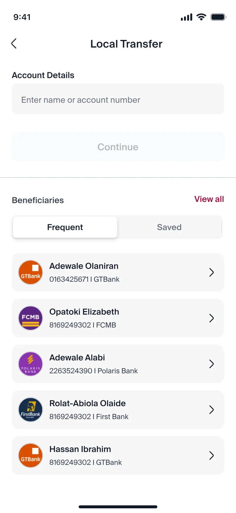
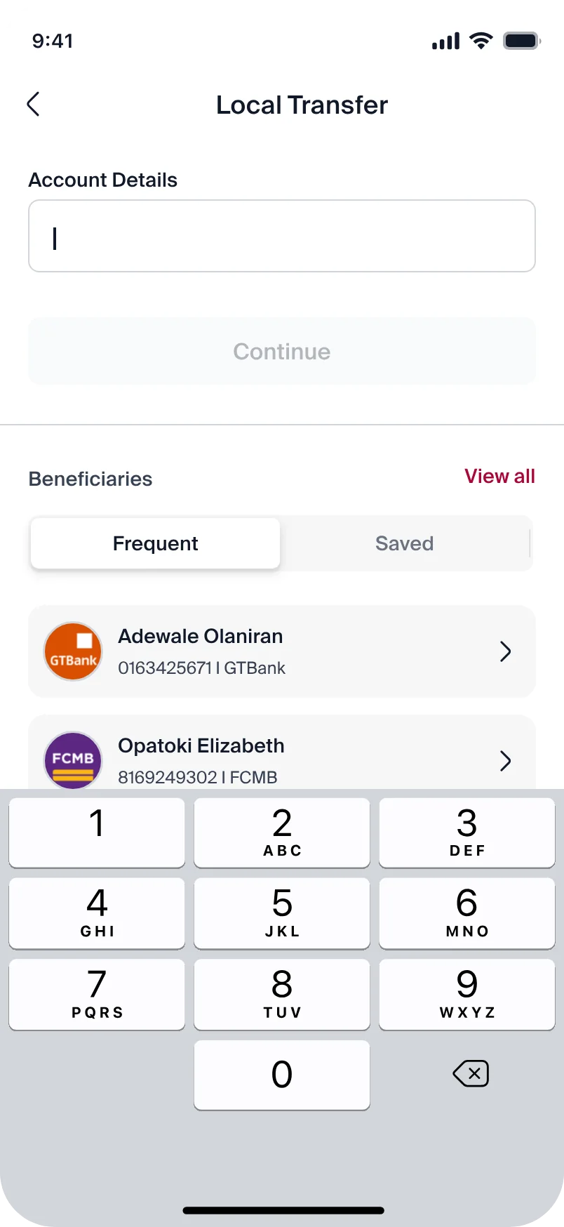
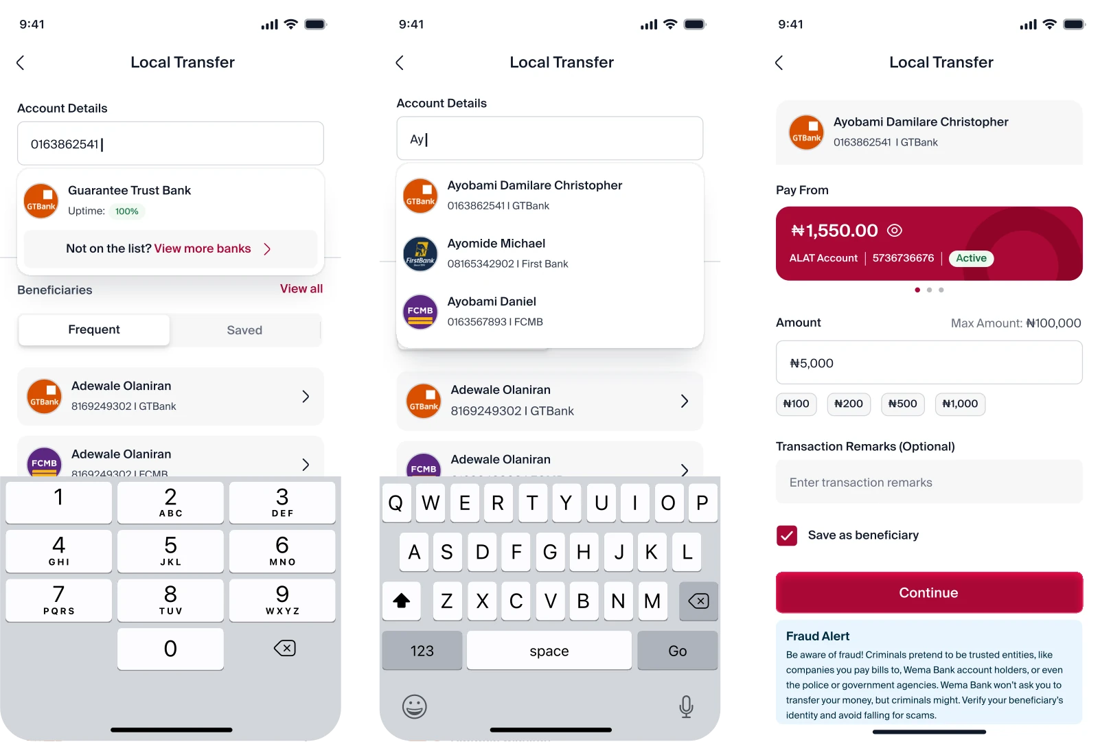
A streamlined experience for sending money to Nigerian banks, making transfers simpler, recipients easier to find and transaction updates clearer
What I Improved
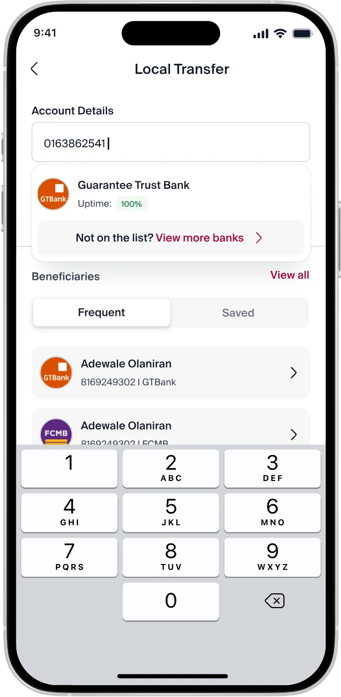
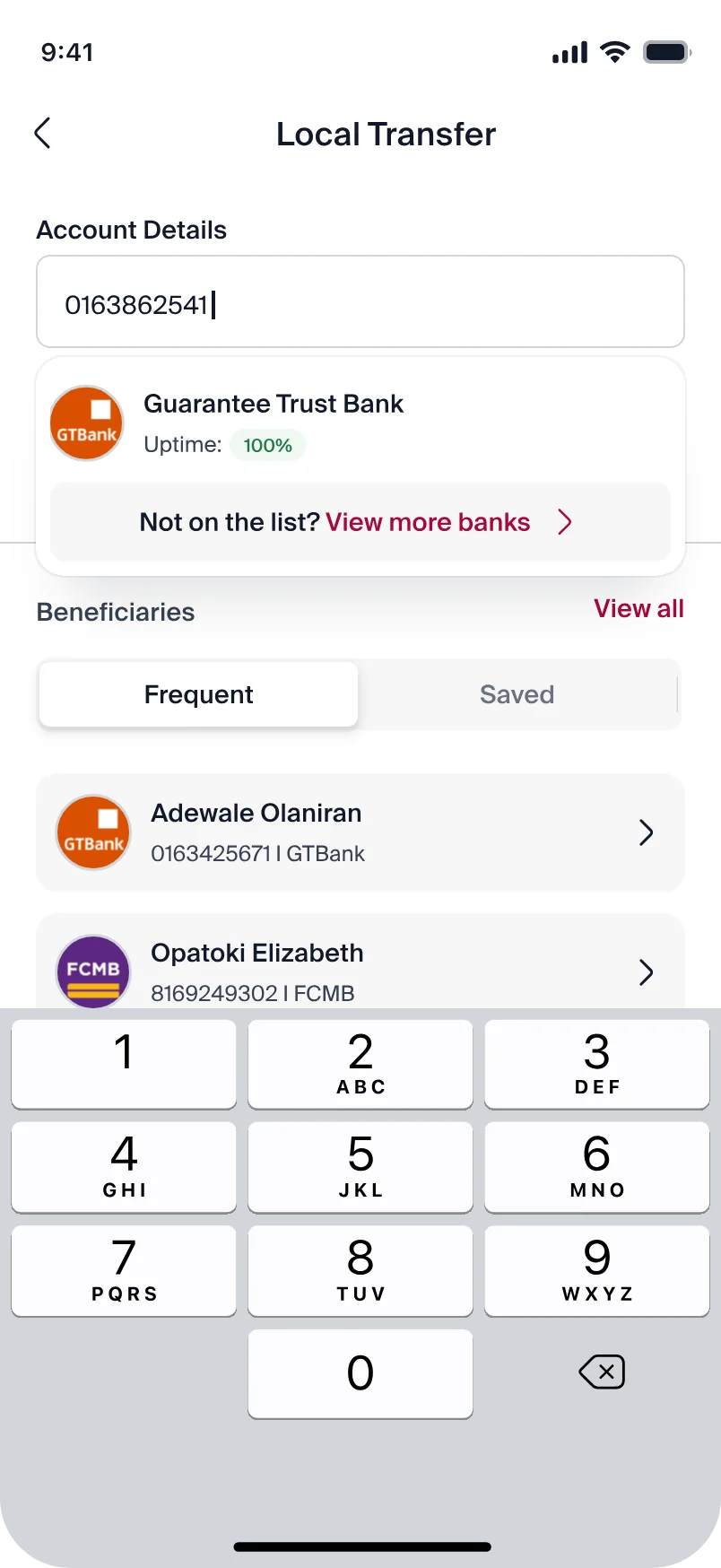
- Real time Bank Name Lookup: Automatically displays the bank name and the bank's uptime percentage as users enter an account number, helping them verify the recipient bank and assess the bank's transfer reliability before proceeding
- Real-Time Account Lookup: Automatically retrieves the recipient's name, bank, and account number when customers enter the details (name/account number) of a previously saved beneficiary, eliminating the need to re-enter their information and making repeat transfers faster and easier
- Easier Access to Beneficiaries: Placed beneficiaries section below the account number field and grouped them into Frequent and Saved categories, helping customers find and select recipients faster without re-entering their details
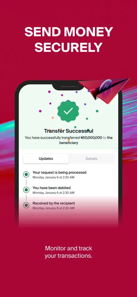
- Clear Transaction Confirmation: Redesigned the success screen to clearly communicate transaction status and display a timeline of key transfer updates
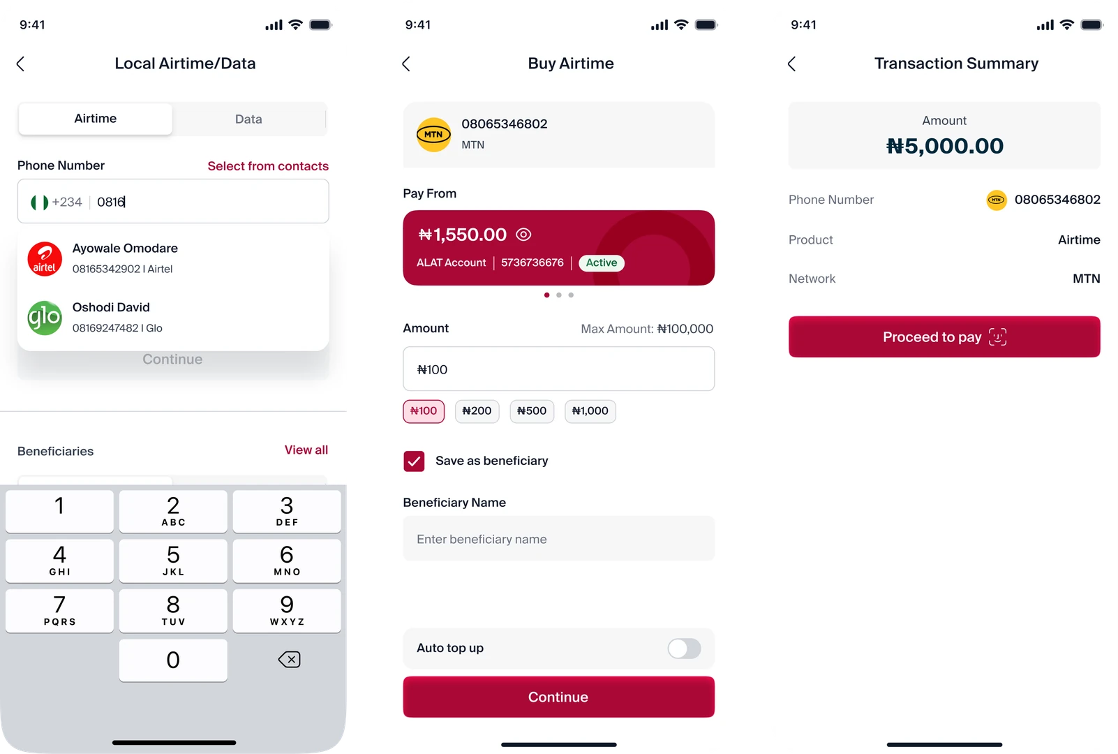
Airtime/Data
A unified experience for purchasing airtime and mobile data, making everyday top-ups easier and faster
What I Improved
- Unified Airtime & Data: Combined airtime and data purchases on one page, using tabs to help users switch easily between the two services
- Faster Repeat Transactions: Displayed previous recipients automatically as users enter a phone number, making repeat purchases quicker and easier.
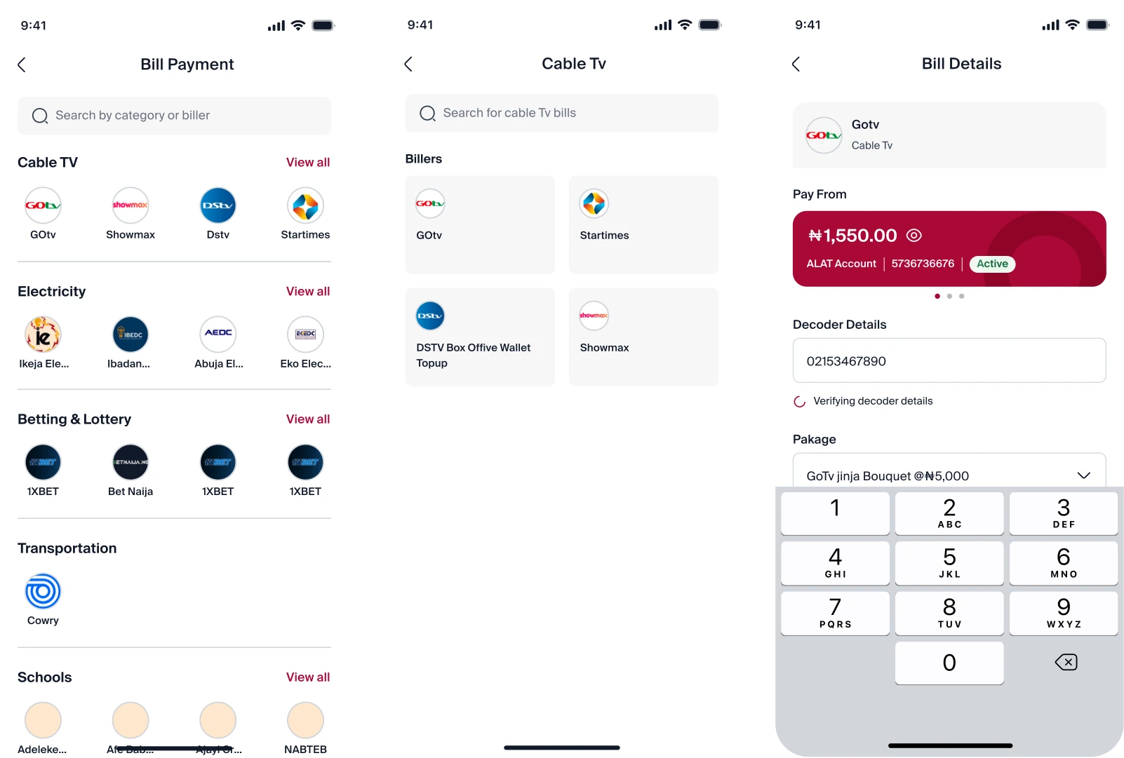
Bill Payment
A simple, centralized experience for finding billers and paying for everyday services
What I Improved
- Quick Access to Popular Billers: Displayed popular billers under each category, allowing users to select frequently used services without browsing the full list.
- Clear Category Layout: Grouped billers into well-defined categories, making services easier to browse and find
- Scalable Design: Created a flexible layout that supports additional billers and payment categories as the platform grows.
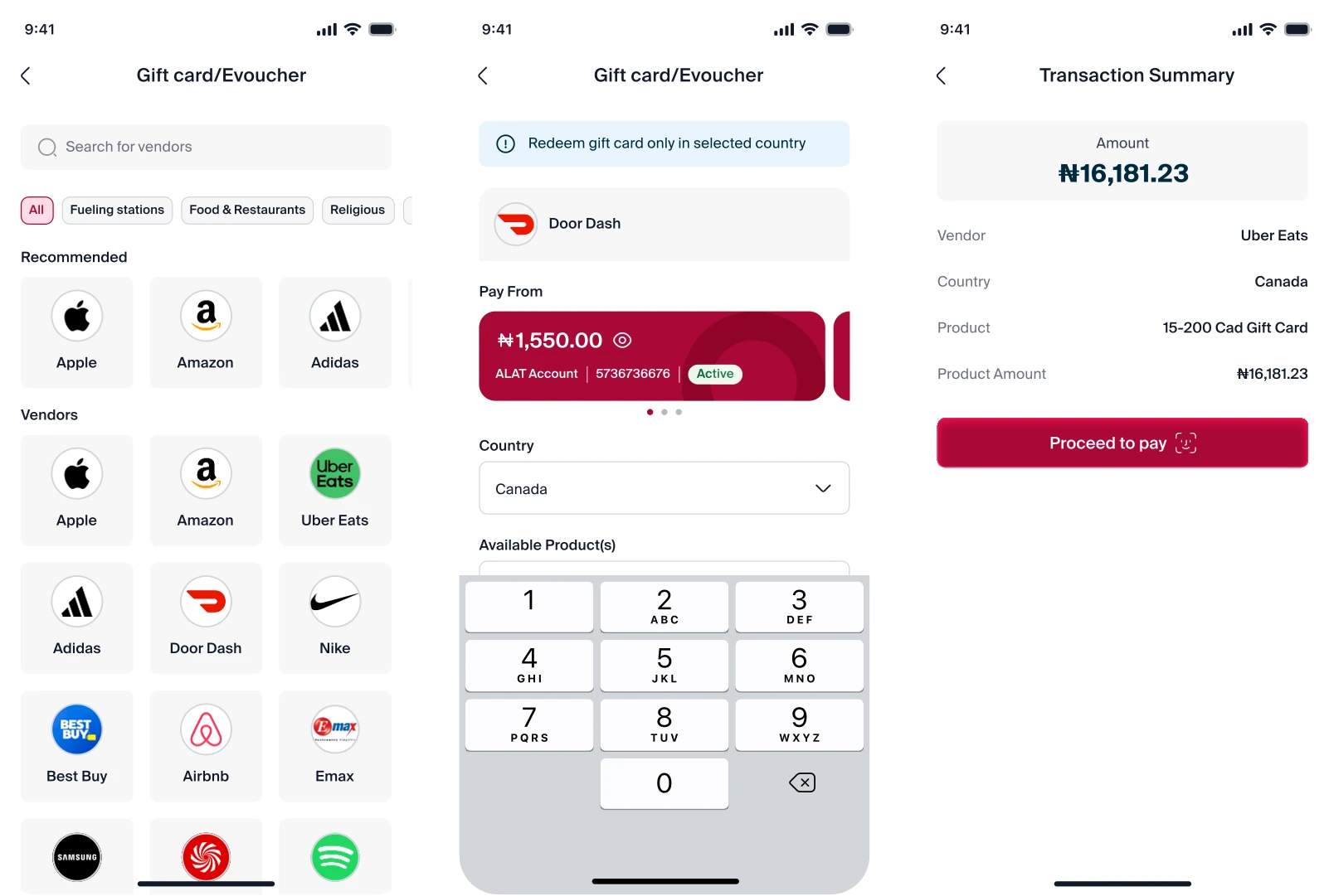
Gift card/Evoucher
What I Improved
- Organized Gift Card Categories: Grouped gift cards into clear categories for easier discovery and access
- Clean, Scannable Layout: Created a well-structured layout that makes gift cards easier to browse and find.
CONCLUSIONS
Reflection & Key takeaways
This project reinforced my belief that good product design goes beyond creating a visually appealing interface. Working on ALAT Payments experience taught me to look deeper into the problems customers were facing, understand the reasons behind those problems, and use those insights to guide design decisions.
I also learned the importance of balancing user needs, business requirements, and stakeholder expectations. Working closely with the product owner and other stakeholders throughout the design process helped me understand how important communication and alignment are when designing products that serve a large number of users.
Most importantly, the project challenged me to think about how small improvements to navigation, information hierarchy, and interaction patterns can make everyday financial tasks feel significantly simpler. It strengthened my approach to designing experiences that are not only clean and modern, but also useful, intuitive, and purposeful.